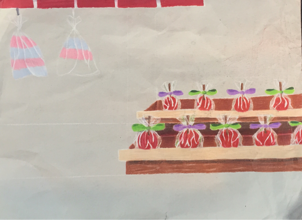
 This is the start to my opacity project. It was not finished because I was going through a very rough time during this project and I wasn't able to get to it. If I were to finish it, it would show that it was supposed to be candy apples at the fair in a food truck. I really was excited to do this project and maybe one day I'll get to finish it. Opacity was quite a challenge for me and I'd like to continue practicing it in my spare time because it was very fun!
0 Comments
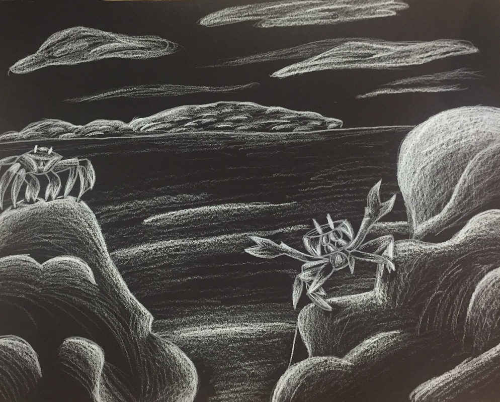  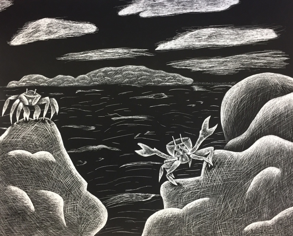 1. The meaning of my artwork was to commemorate the 14 years that I lived on the beach in Jupiter, Florida. This piece meant a lot to me because the beach was a huge part of my life for such a long time and I finally got to create something that represented that.
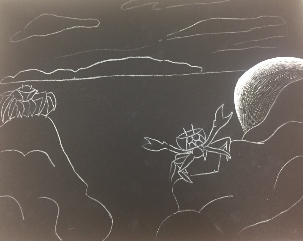
2. I used cross-hatching to create the rough texture on the rocks and I used smooth lines on the crabs to create the softness of their actual shell. I used a mixture of cross-hatching and smooth lines to create the island in the background. 3. I tried not to put anything smack in the middle of the piece and I think that made everything come together. 4. I implied movement in my scratch board by using the clouds and the water to make the artwork actually come to life. You can see the ridges in the water instead of it just being a flat plain. You can also see the movement in the clouds because they are all spreading out towards the right side of the paper. 5. I definitely could have used more practice with the scratch board and planned out how I was going to do the water. I feel like the water could have splashed against the rocks and it would have looked really nice. I could've done better on the clouds as well, I feel as if they look messy. 6. How did you demonstrate a wide range of shading values? I was very delicate with the x-acto knife when creating the grey values and I pushed very hard with the tool to make it white. It was weird being the total opposite of a pencil on white paper but it was very fun! 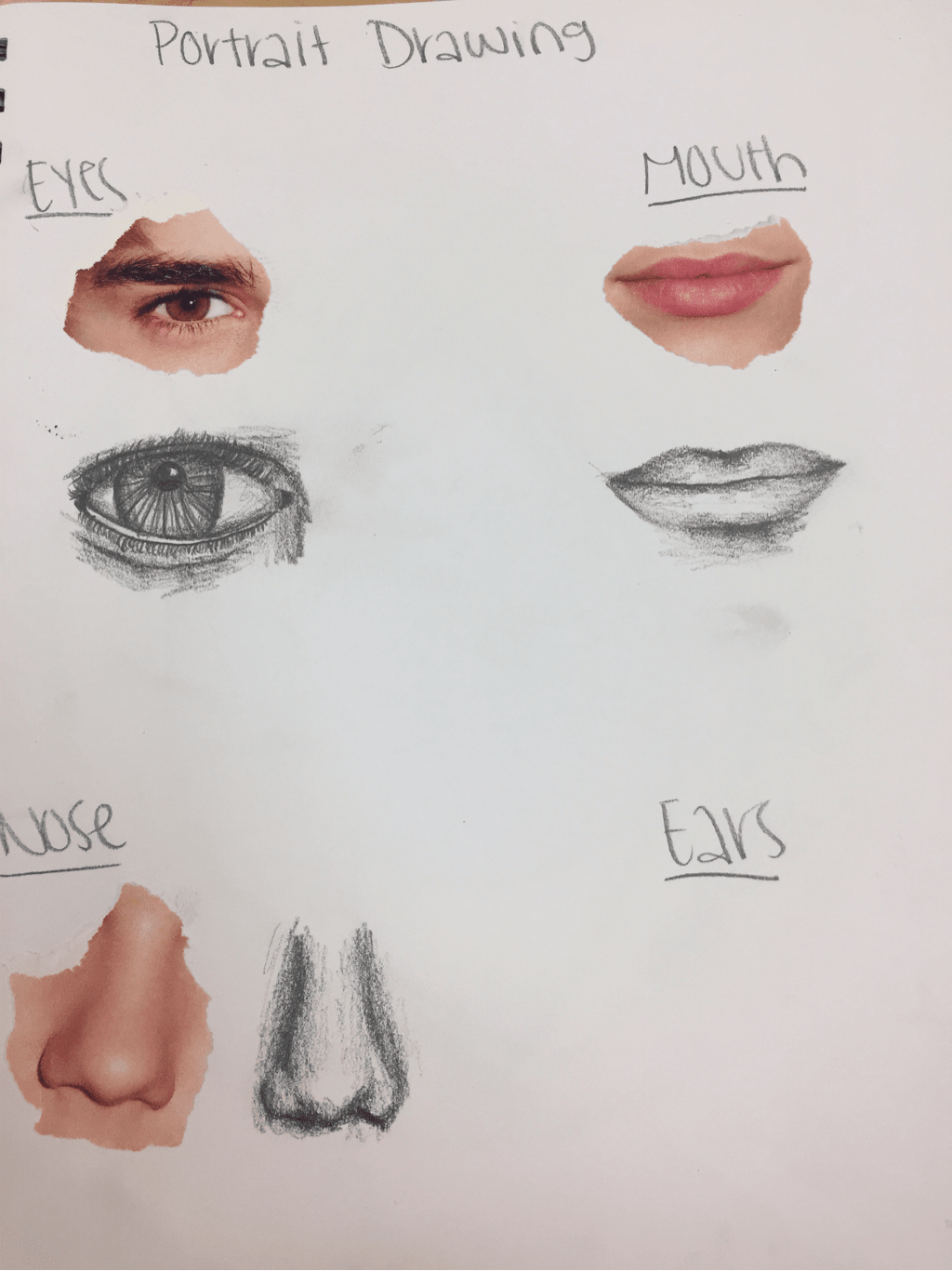 We took pictures from a magazine and had to draw those facial features and I think I did a decent job. 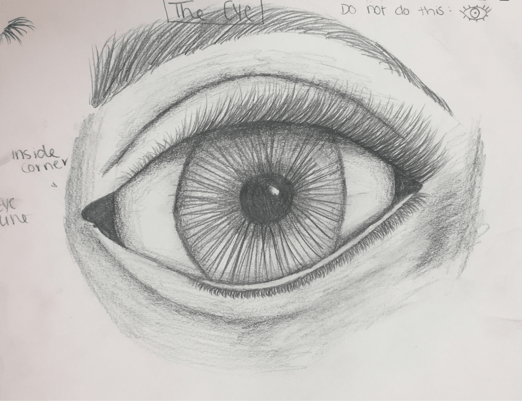 We practiced how to draw and eye and this is the first eye I've ever drawn and I was so proud of how it turned out. 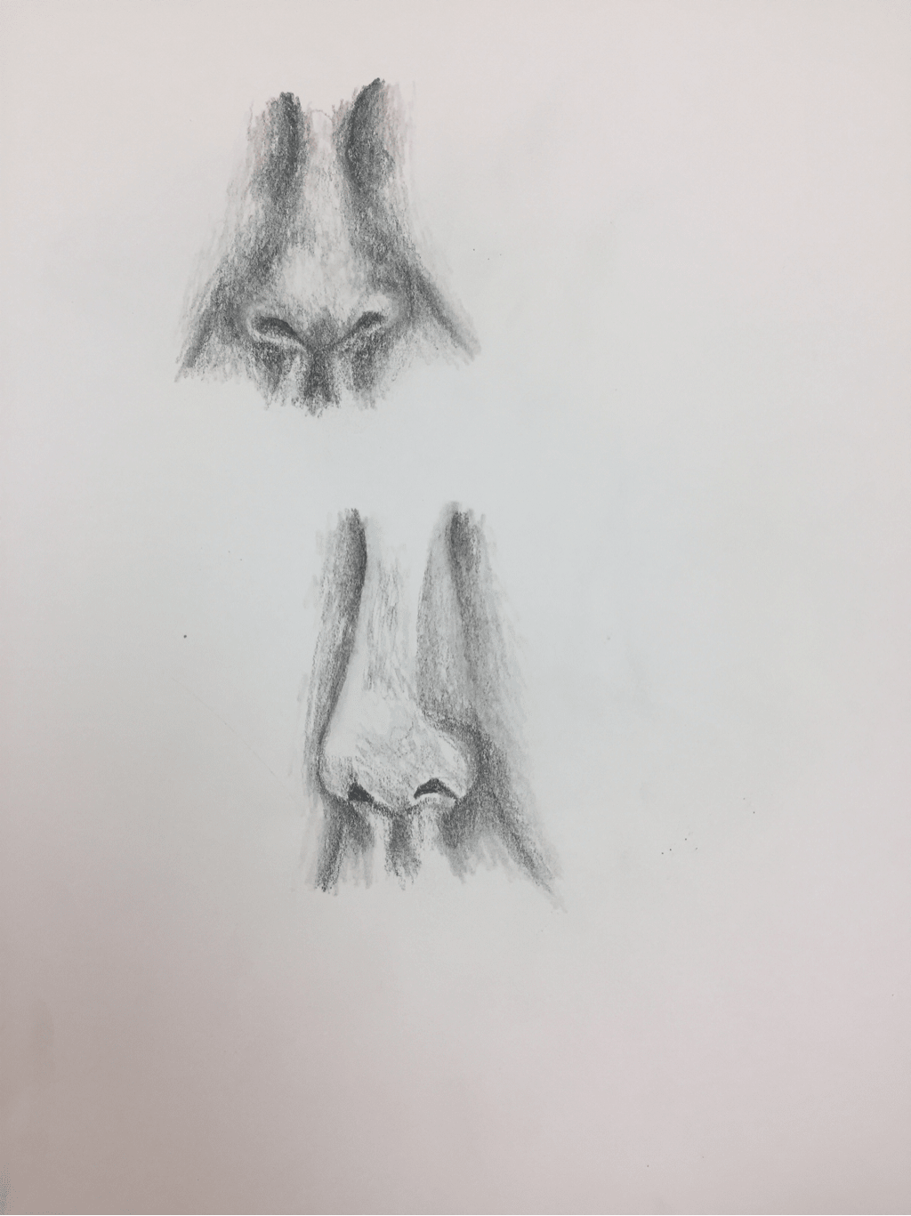 These are the best noses I've ever drawn in my life because I've never really been into drawing portraits, but after this project I really am. 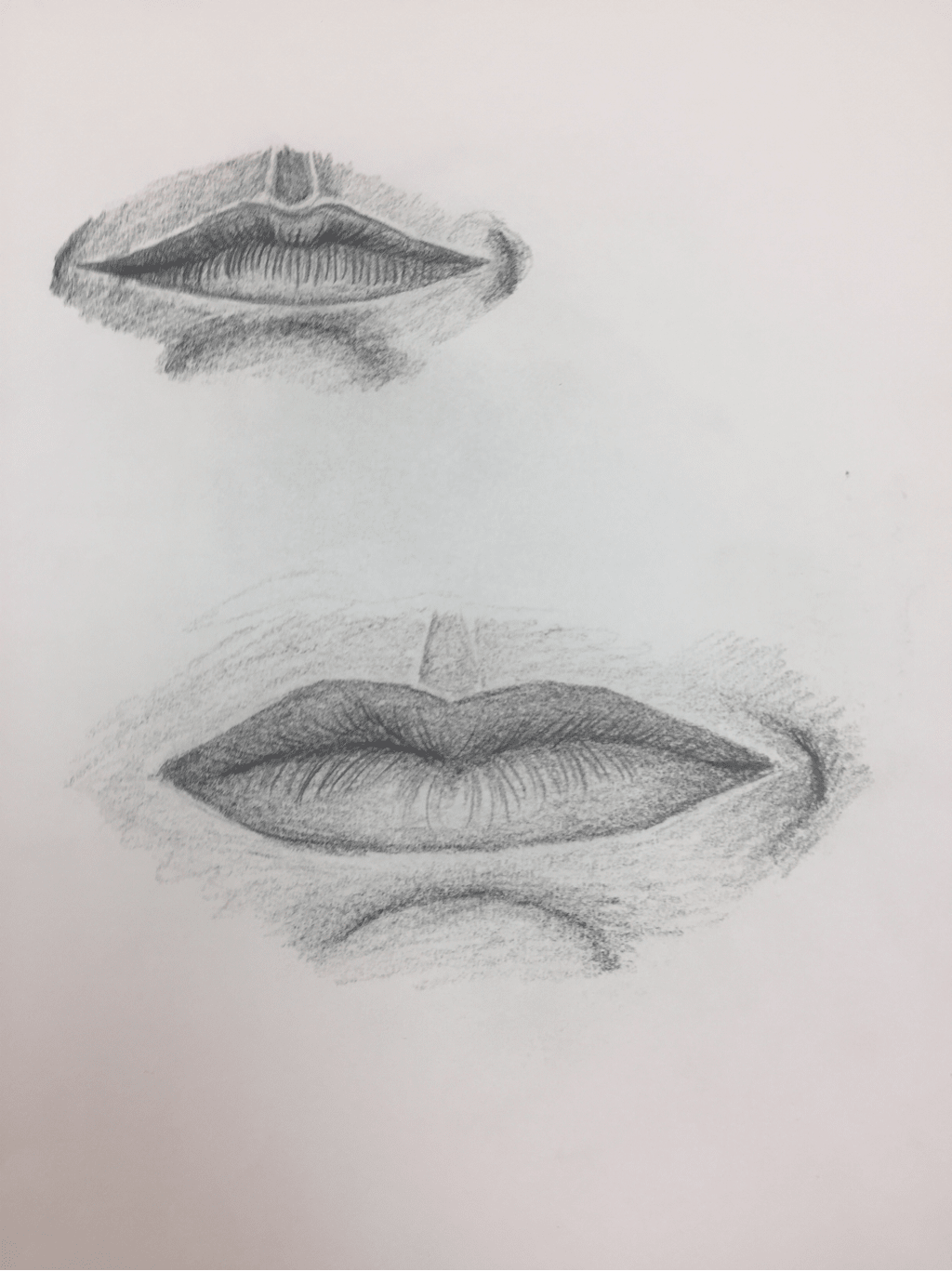 I did these lips at home because I missed class that day so these were based from the video and I think they turned out pretty well. 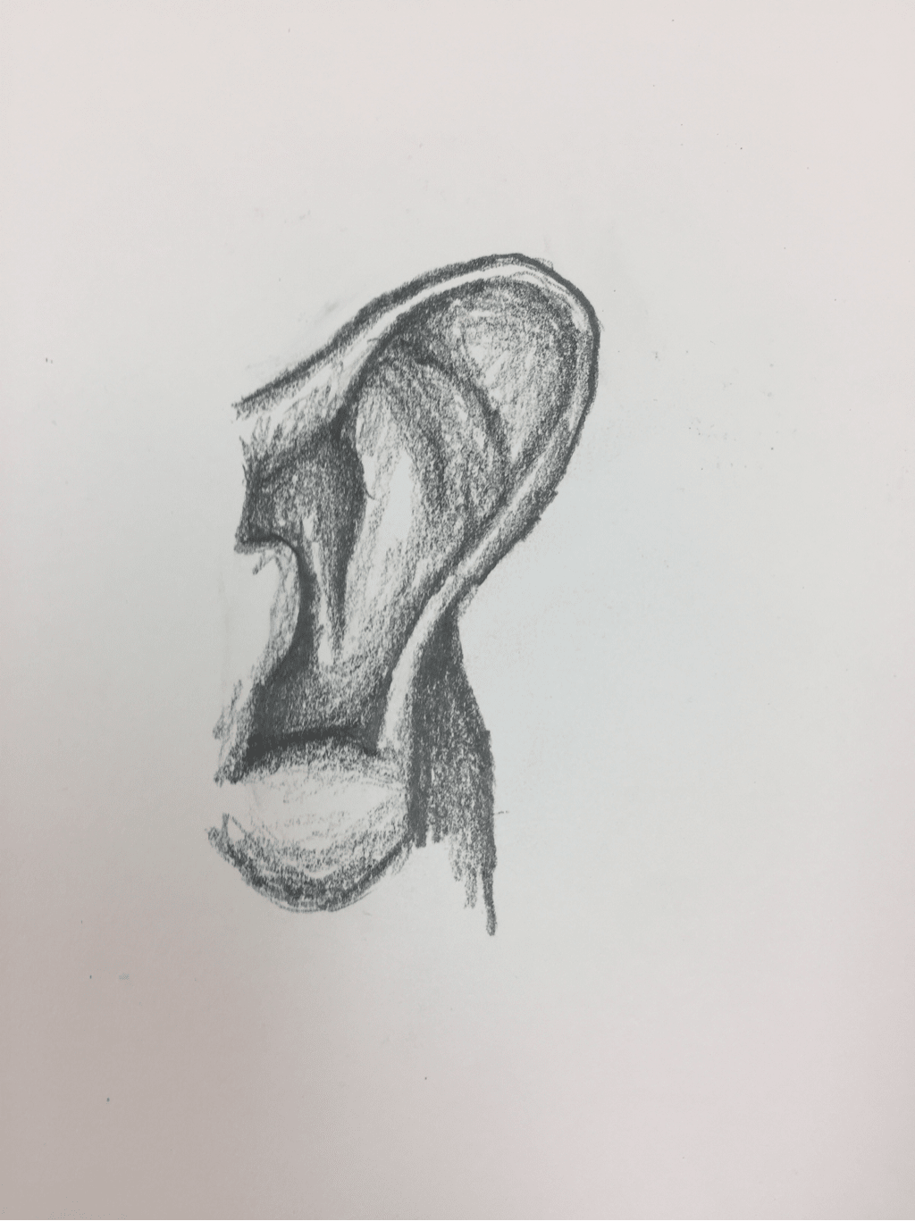 This is the first ear I've drawn and I think it's okay it could've been a lot better.
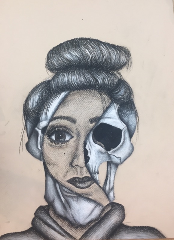
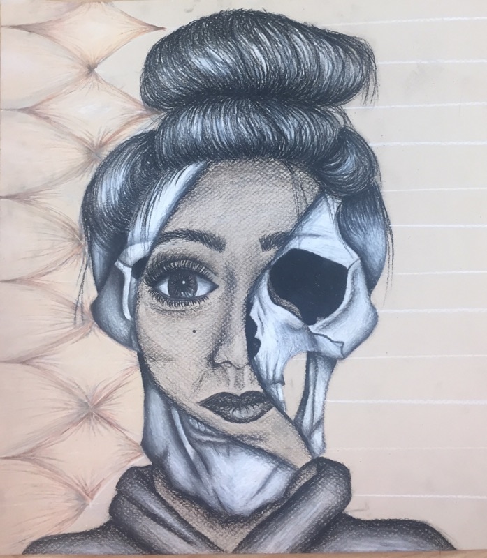
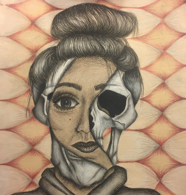
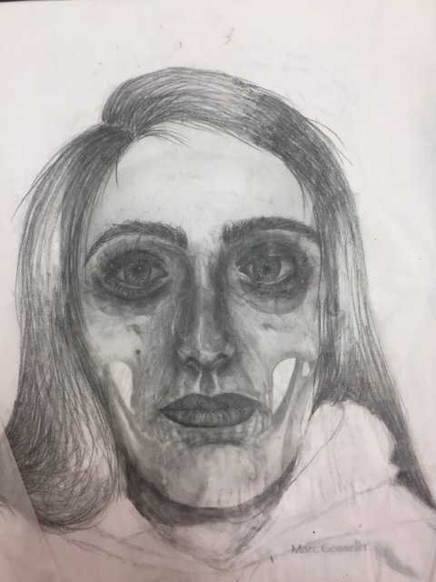 This is a drawing we did on transparent paper over a printed picture of a skull. I truly and deeply hate this drawing and I could have done so much better. I look wrinkly and like an old man. I think I showed a lot of progress with my final portrait drawing.
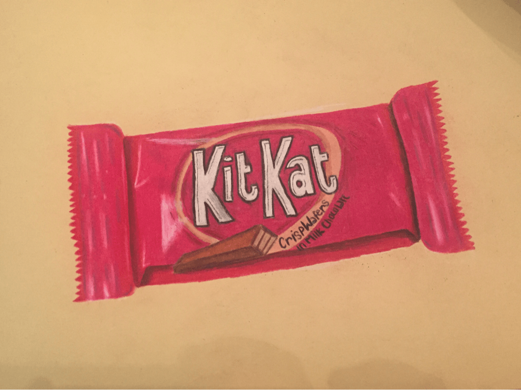 This piece could have been better in my opinion the lettering looks too rushed. I did try, though, to keep the shininess throughout the wrapper and I think I did a decent job at that. Created with prisma colors.
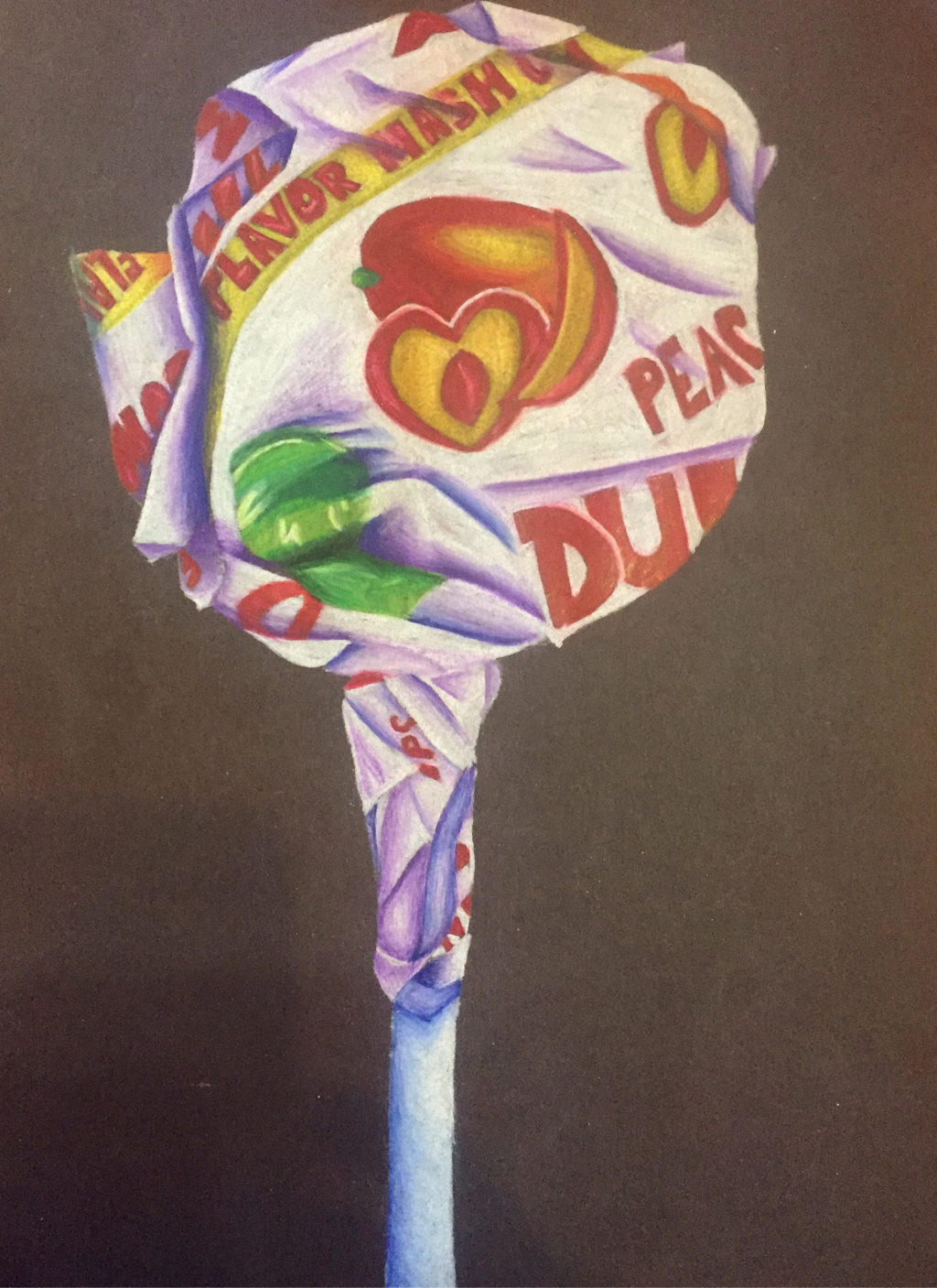 For this project we drew Dum-Dum lolipops using prisma colors. I put a twist on this piece by using colors that aren't actually seen on the lolipop. The purples and blues really made the whole project come together in my opinion.
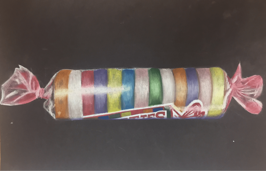 For this project we created smartie candies with a wrapper still on it. We used pastels and that was my first time using them. I liked them other than the fact that they'd get everywhere. Creating a clear wrapper was really challenging for me but I think throughout the drawing I progressed well and was able to create the piece.
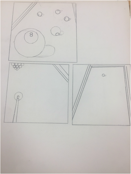
These are my 5 compositional sketches that I created before I did my final drawing. 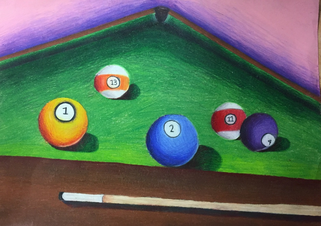 1. I created an interesting point of view by making the balls in the front bigger and towards the back smaller and making the end of the table smaller in the distance.
2. It's important to understand perspective because it gives the art piece dimension whether its drawing or painting or whatever you chose. If you don't use perspective you wouldn't be able to tell what's closer to you and what's further away from you and nothing would look at all realistic. 3. The colored pencil exercises helped me a lot when creating this piece because I have never used them before so if I went and did this drawing with no prior knowledge of how to use colored pencils the whole drawing would have been an unblended mess. 4. The technique I used for my colored pencils was using the lightest color first then creating shadows using different colors you wouldn't normally use. I think everything is fairly blended it was just really hard on the green part of the pool table because I also wanted it to have some texture. 5. I think I was able to create depth by making it noticeable that the balls in the front are the bigger ones and the pocket is smaller because it's in the back. 6. Using prisma colors were very challenging for me and getting how to blend down was difficult because sometimes I didn't know how hard to press my pencil down on the paper. The advantages to using colored pencils was I was able to use different colors no one would use for creating value. 7. I do think I was prepared for the most part for this project but I would like to have studied how to use colored pencils more and the techniques for creating texture.  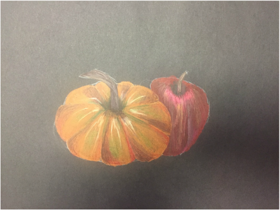 We learned how to use prisma colors which I personally have never used before and I learned how to use different colors to create shadows and value and how to use different pencil strokes to create texture.
|
AuthorWrite something about yourself. No need to be fancy, just an overview. Archives
January 2017
Categories |
 RSS Feed
