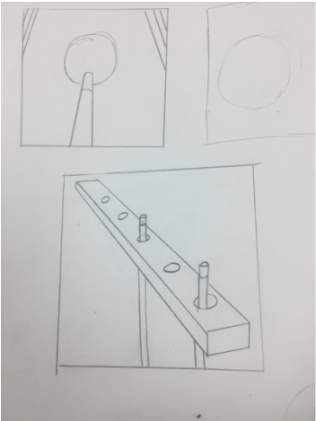
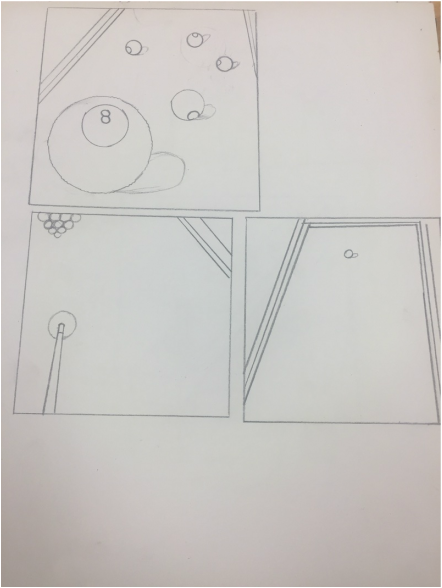
These are my 5 compositional sketches that I created before I did my final drawing. 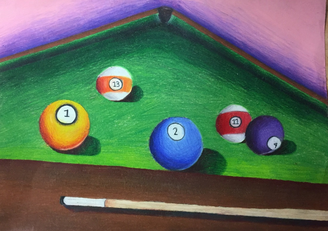 1. I created an interesting point of view by making the balls in the front bigger and towards the back smaller and making the end of the table smaller in the distance.
2. It's important to understand perspective because it gives the art piece dimension whether its drawing or painting or whatever you chose. If you don't use perspective you wouldn't be able to tell what's closer to you and what's further away from you and nothing would look at all realistic. 3. The colored pencil exercises helped me a lot when creating this piece because I have never used them before so if I went and did this drawing with no prior knowledge of how to use colored pencils the whole drawing would have been an unblended mess. 4. The technique I used for my colored pencils was using the lightest color first then creating shadows using different colors you wouldn't normally use. I think everything is fairly blended it was just really hard on the green part of the pool table because I also wanted it to have some texture. 5. I think I was able to create depth by making it noticeable that the balls in the front are the bigger ones and the pocket is smaller because it's in the back. 6. Using prisma colors were very challenging for me and getting how to blend down was difficult because sometimes I didn't know how hard to press my pencil down on the paper. The advantages to using colored pencils was I was able to use different colors no one would use for creating value. 7. I do think I was prepared for the most part for this project but I would like to have studied how to use colored pencils more and the techniques for creating texture.
0 Comments
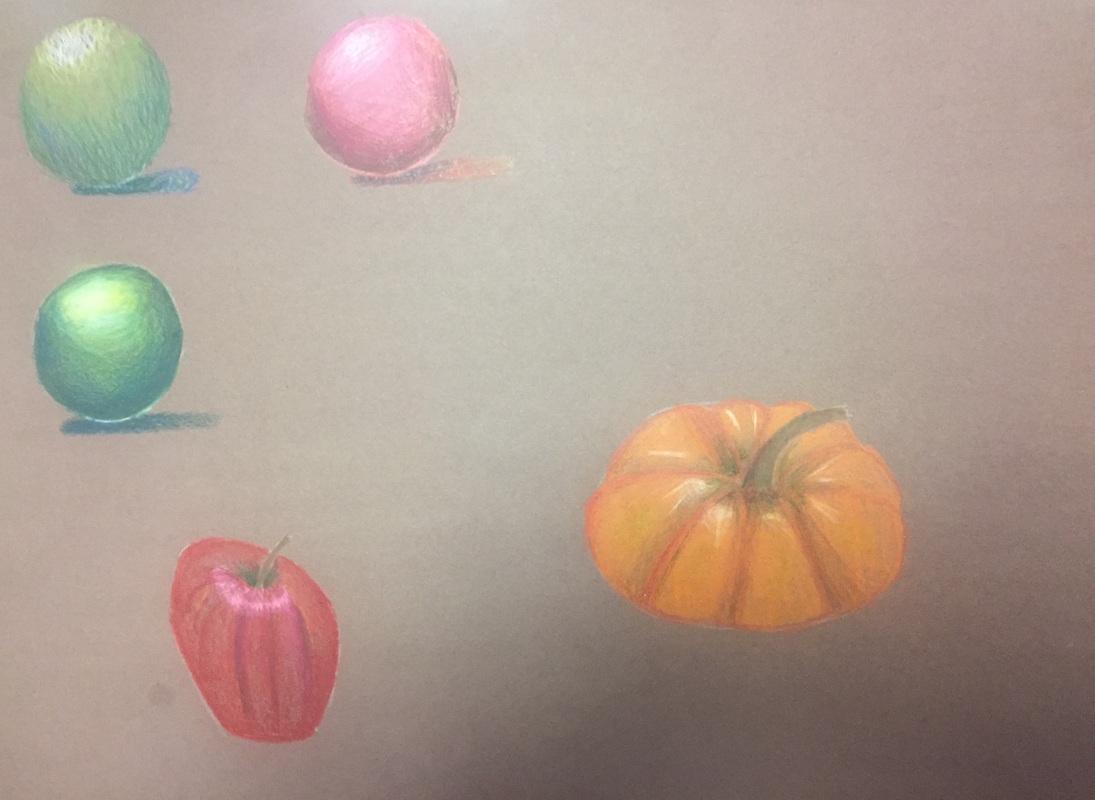 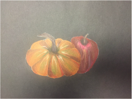 We learned how to use prisma colors which I personally have never used before and I learned how to use different colors to create shadows and value and how to use different pencil strokes to create texture.
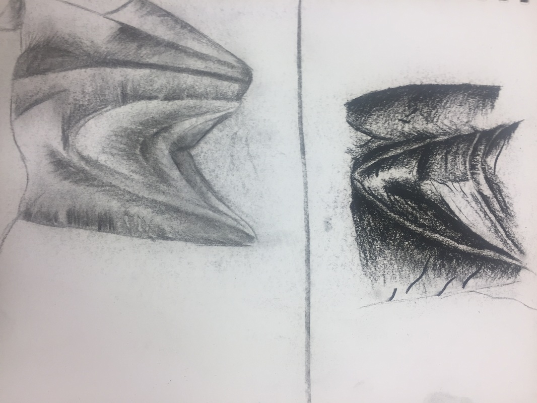 These were zoomed in sketches using vine charcoal and normal charcoal before I created the final fabric drawing. 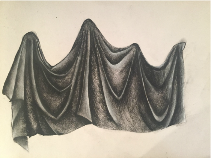 1. I utilized all the 9 values but the lightest and darkest values are more prominent.
2.Practicing the value chart helped me create contours with shading. 3. Where the fabric was behind another piece of fabric or it had a shadow i put more pressure on my charcoal but if the fabric was closer or in front of another piece i rarely used pressure and also added white. 4. Texture is something I always struggle with so I ignored the wrinkles in the fabric for the most part. 5. If I could recreate this piece I would use more medium tones and lighten up the darks just a little bit. 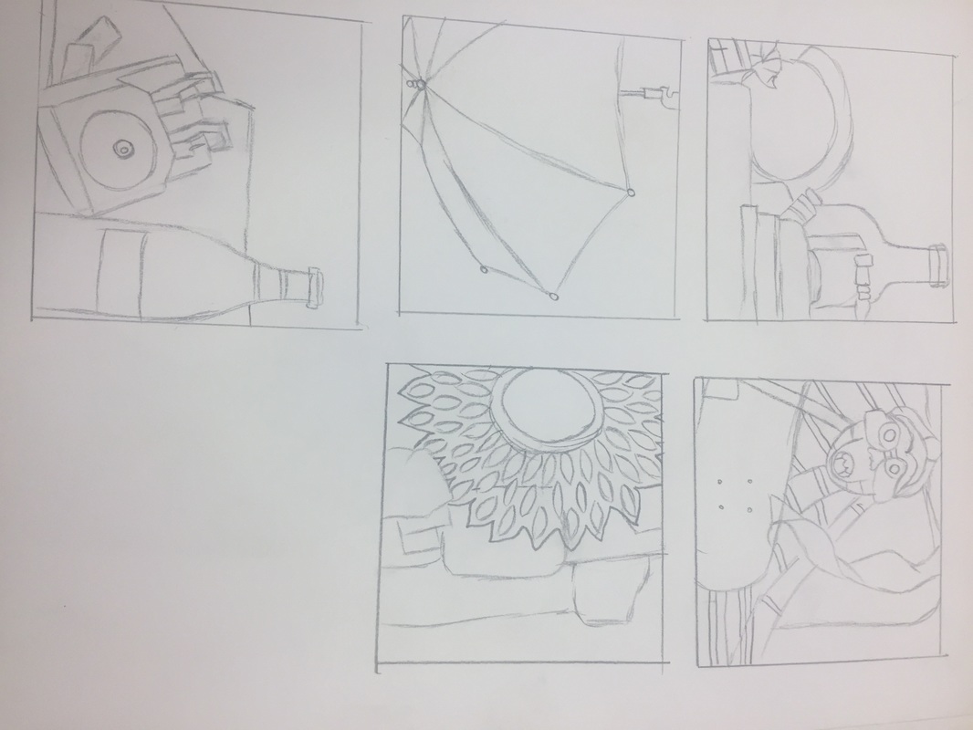 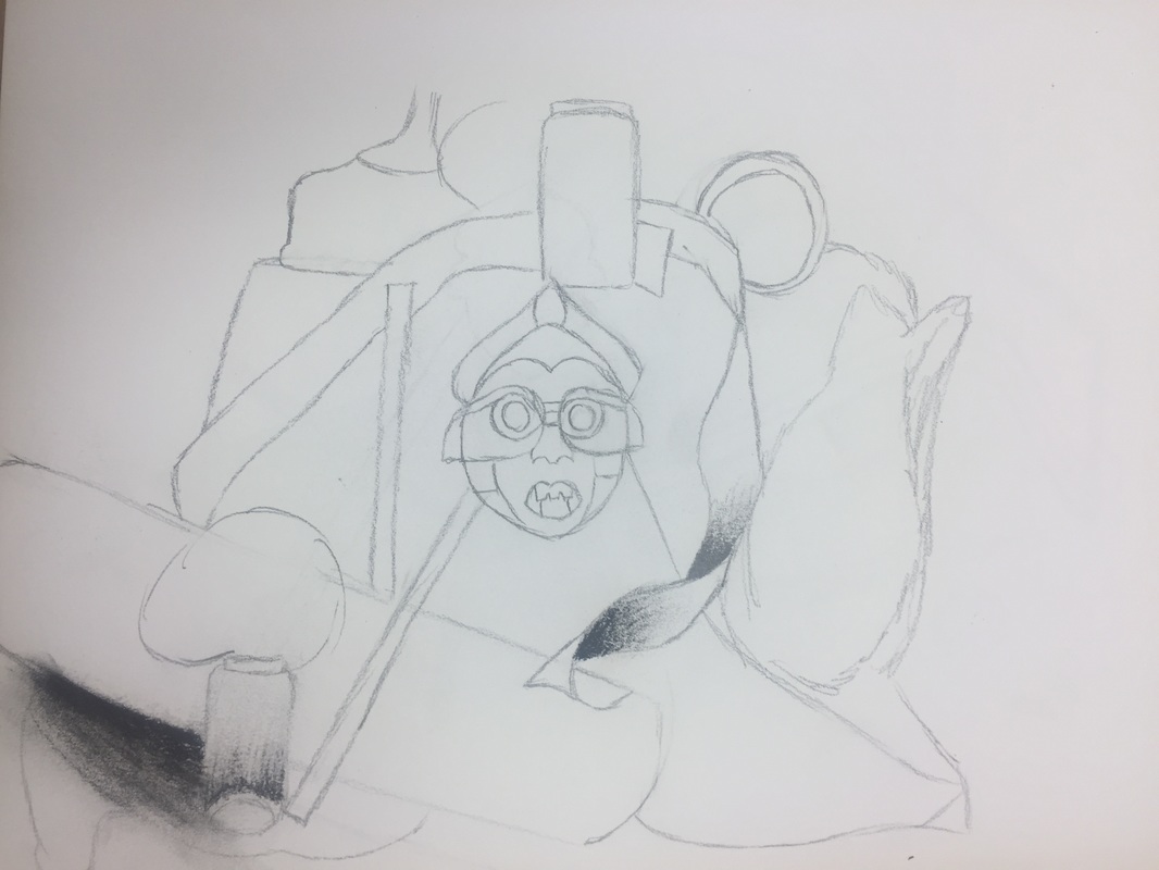 Before we started our final still life project, I created 5 compositional sketches. Then I furthered one of those sketches to plan for my final. 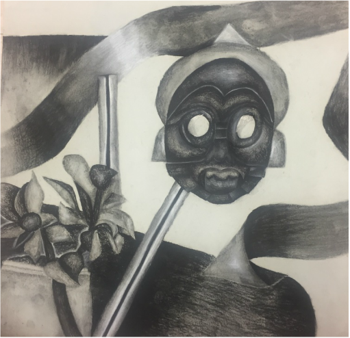 1. My drawing is blended very well and I have very clean edges so you can see where one object stops and another starts.
2. For the most part my values are realistic but I feel if I finished it would be more realistic looking. I used all the values that are included in that value chart we created and studied. Values are important because it shows you where the light hits things and where something crosses over another object and what's further away and what's closer to you. 3. On certain objects there is a clear source of lighting but I admit I could've done better using one source of lighting for all objects. 4. The compositional sketches were important to me because it helped me figure out what I wanted to draw and to plan what type of media I was going to use for my final drawing. 5. My final drawing is successful because I used all the values in the value chart and for the finished parts of the drawing it looks very real. 6. My proportions are very correct it's just very hard to tell because I did not finish the fabric in the background. 7. The placement of the objects in my still life are actually very pleasing to me because the ribbon makes your eyes look around the paper and not just in one spot. 8. The center of interest is the mask most definitely and it's located off center and I like that a lot. 9. I could have utilized my time more considering I did not finish the drawing and I can definitely improve with how dark I make my shadows. 10. The details of the mask was definitely something I struggled with but I overcame this by taking it slow and breaking it into pieces so I'm not as overwhelmed. 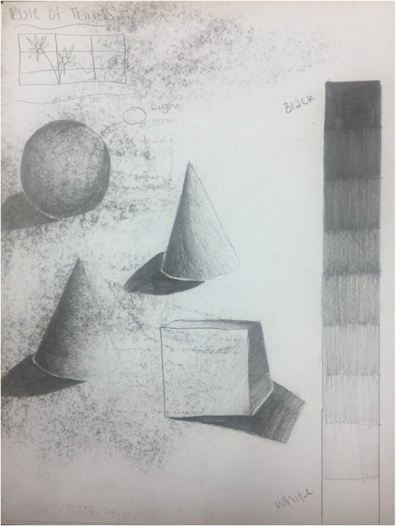 For this activity we created a value chart where you can see each square goes from light to dark gradually. using the value chart I made four shapes and shaded them with shadows.
|
AuthorWrite something about yourself. No need to be fancy, just an overview. Archives
January 2017
Categories |
 RSS Feed
